Reimagining the Covered California Homepage
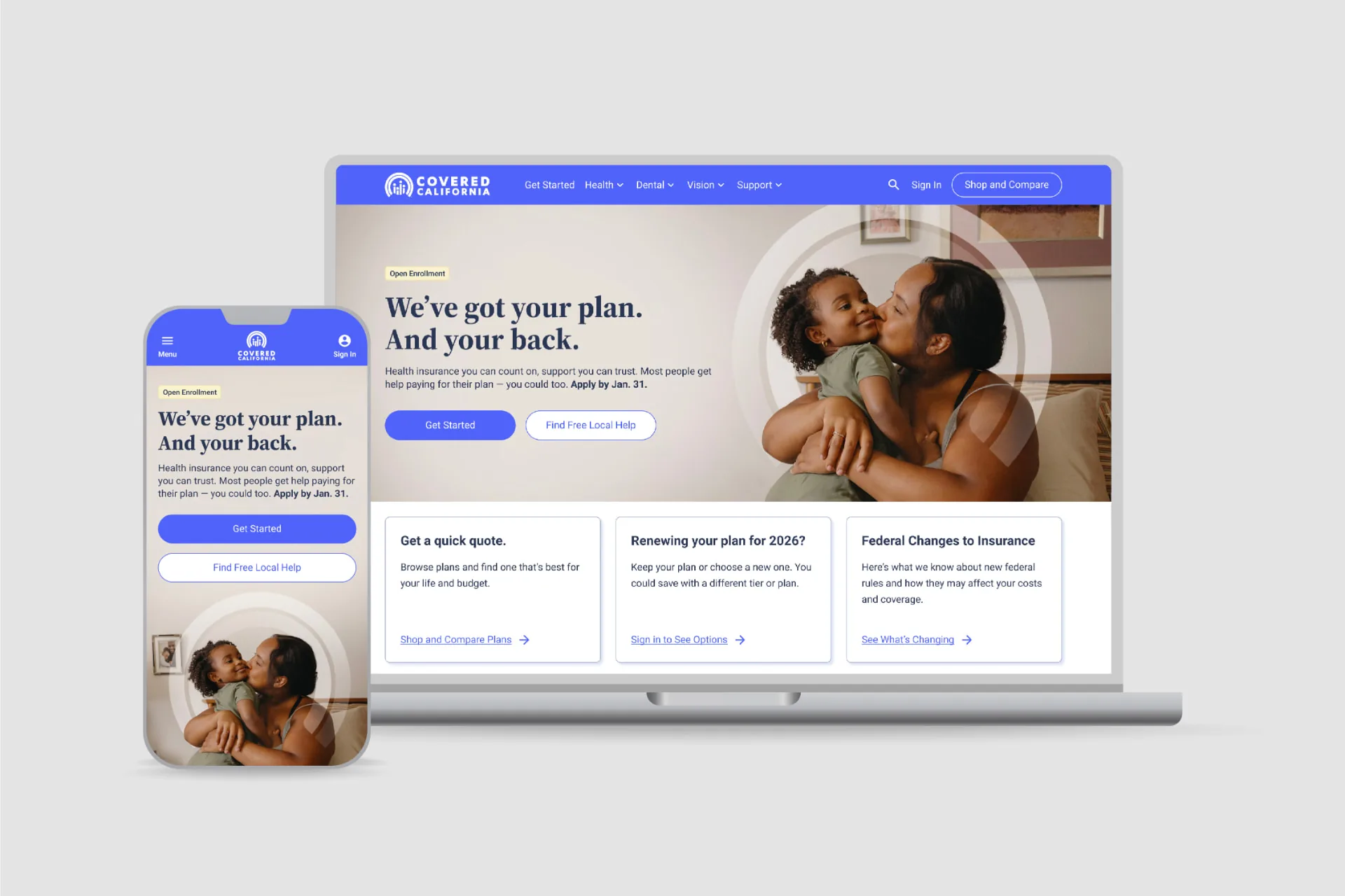
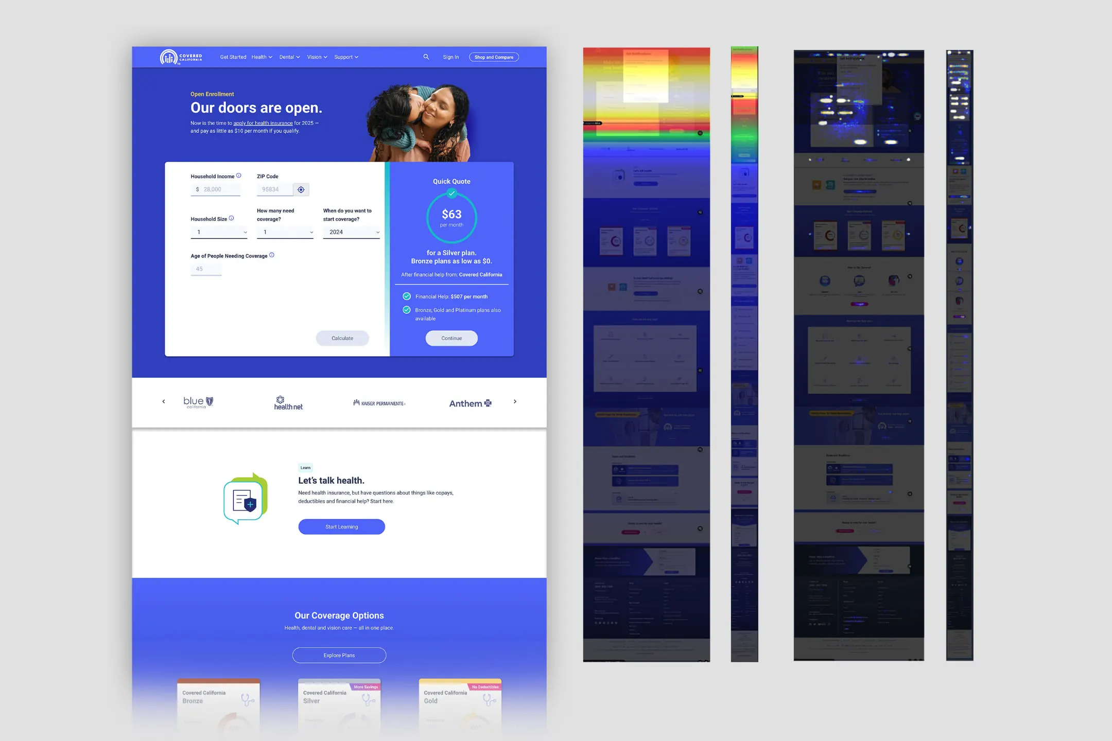
As the site's most visited page, the Covered California homepage should have been the clearest entry point to coverage. Research revealed gaps in how it explained who Covered California was, what it offered, and where to go next. Heatmaps also showed that most visitors never reached the primary call-to-action, nearly 70% down the page. I led a full rethink of the narrative and structure.
- Role
- Lead UX Designer, Researcher
- Focus
- Healthcare, Research, UI Design
The Problem
The homepage lacked a clear hierarchy and a coherent story. It presented tools and competing messages before helping visitors understand their coverage options or choose a next step. The challenge was to make the whole page a more useful starting point, not simply refresh its hero.
People arrived with no context and were asked to act anyway. The page opened by pushing them toward a cost estimate, which meant handing over personal details and talking about money before it had explained what Covered California is or what someone would actually get. The ask came before the value.
The hero also duplicated Shop and Compare, the site's main estimate tool. The page tried to serve too many audiences at once, a problem compounded by generic stock photography that could also appear on unrelated websites. An email popup interrupted visitors before they understood who Covered California was.
Most critically, there was no visible path to human enrollment help, despite roughly 55% of applicants relying on a professional to enroll.
Research & Discovery
I benchmarked every state-based health exchange in the country and a range of private insurers. Two quantitative surveys helped clarify visitors' pain points and motivations. Most visitors were still deciding where to start. They needed a clear story about what Covered California offers, why it matters, and what to do next.
The research established six requirements for the new homepage:
- 1Make clear who Covered California is and how it can help.
- 2Let people start an application without hunting for the way in.
- 3Show visible help for anyone who knew they needed a hand.
- 4Offer one estimate tool, not two.
- 5Put account access within reach for anyone ready to view or change what they already have.
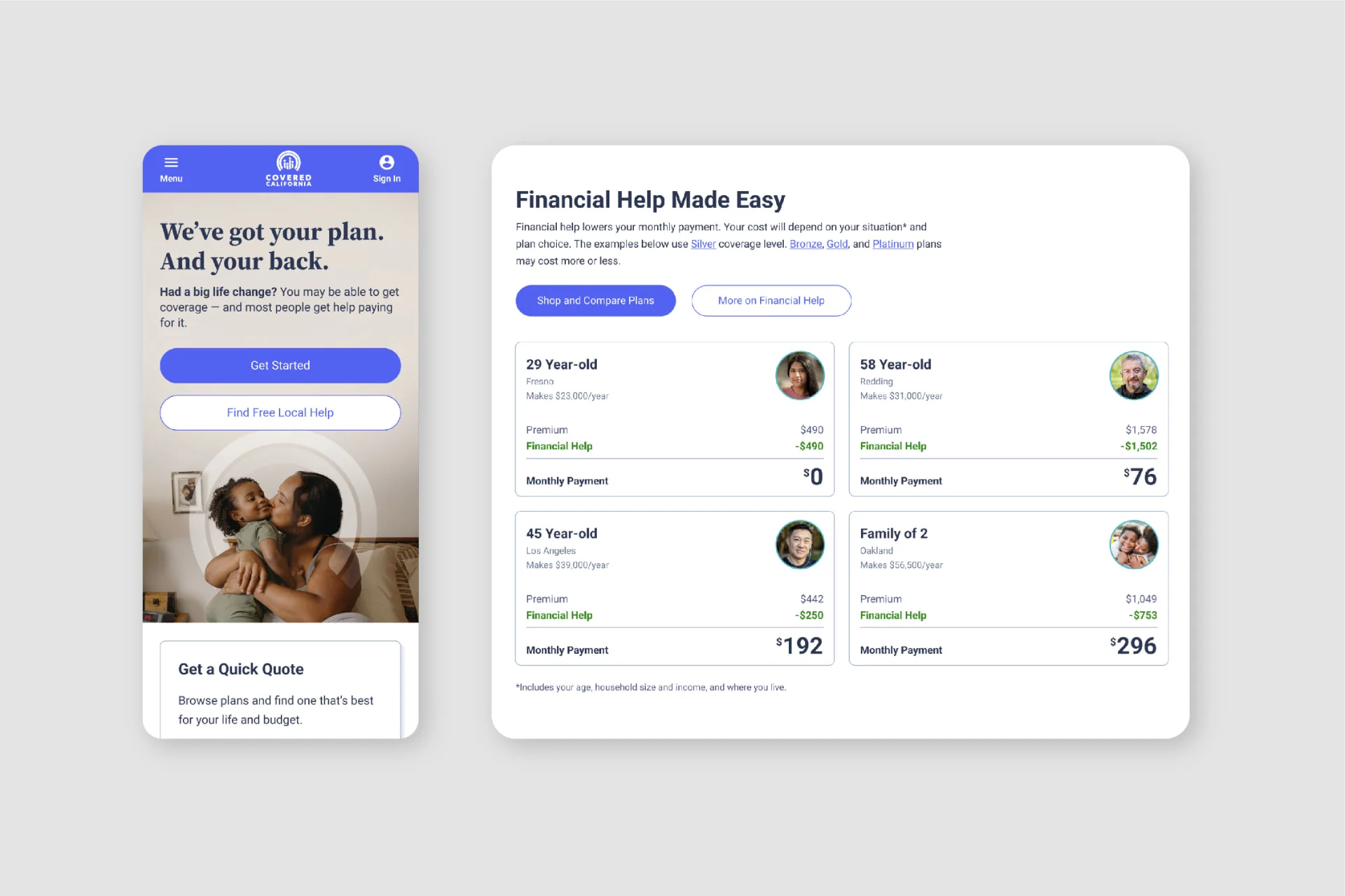
- 6Explain financial help plainly, including what actually shapes what someone pays.
Design & Iteration
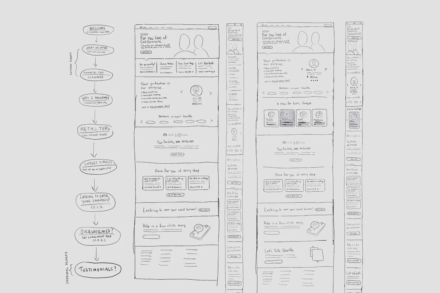
The selected direction put the value proposition above the fold, alongside four clear pathways: apply, get help, get an estimate, and sign in. We removed the homepage-only calculator and directed visitors to Shop and Compare for estimates.
In place of the calculator, “Real Californian” profiles showed a range of incomes and costs without anchoring visitors to a single estimate. We reduced the help section from twelve topics to the three most common, with a clear path to the rest.
The Final Direction
We began with sentiment testing on a low-fidelity wireframe, then ran two first-click tests on a mid-fidelity version. A final qualitative study evaluated the high-fidelity mockups. Each round tested the narrative, hierarchy, and visual direction before launch.
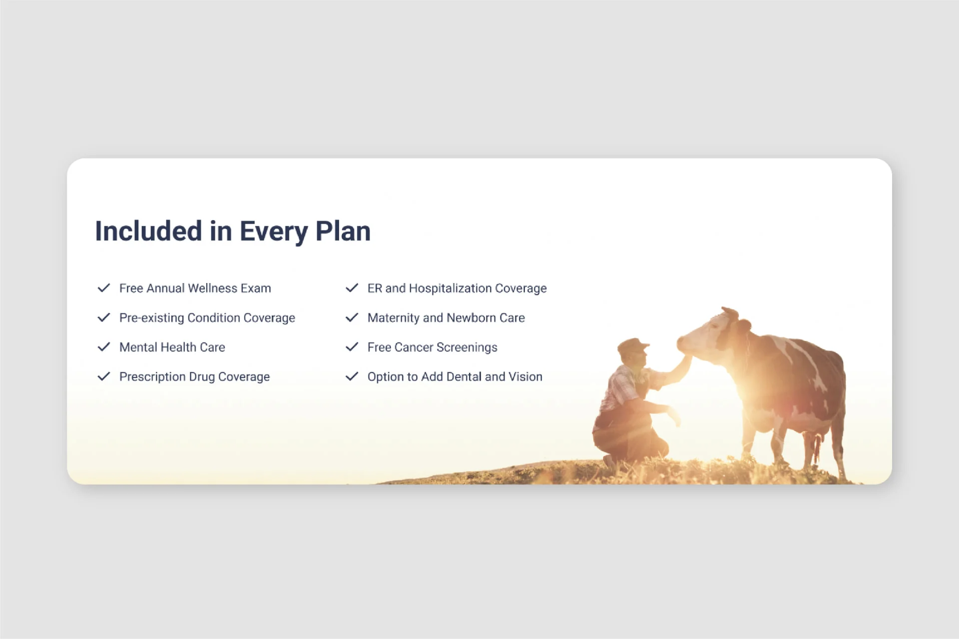
The final design used newly created, proprietary brand assets in place of generic stock imagery. These gave the experience a more distinctive visual identity and a stronger connection to the Covered California brand.
The Outcome
After launch, the redesigned homepage saw a lower bounce rate, longer engagement, and a higher conversion rate. A follow-up usability study confirmed that the live page felt more focused and actionable. The findings supported the shift from a fragmented, tool-first page to a clear, story-driven one.