Reimagining CiCi, Covered California's Chatbot
Covered California's chatbot had gone six years with no real design attention, just new Q&A pairs bolted onto an aging interface. I led a full reimagination: simplifying the UI, giving it a distinct visual identity, and rethinking what CiCi could actually do for people.
- Role
- Lead UX Designer, Researcher, Illustrator
- Focus
- Conversational UI, Accessibility, Research
The Problem
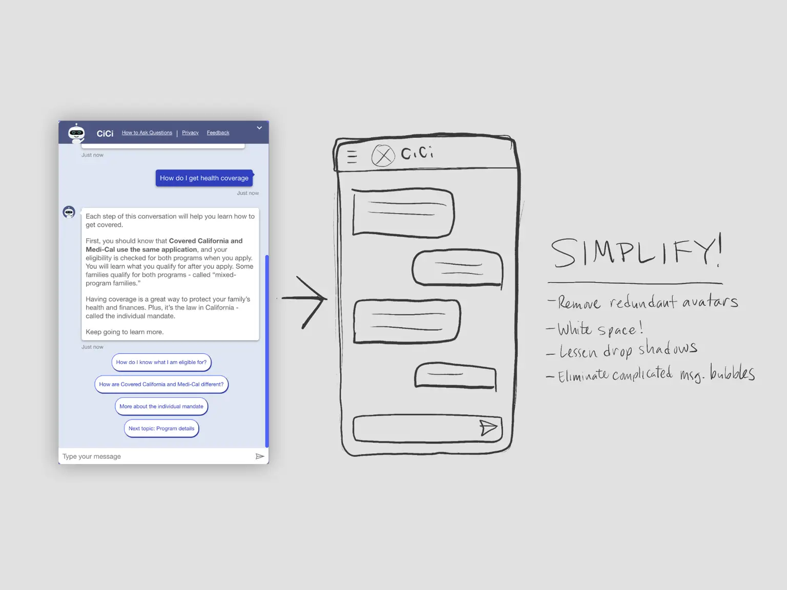
A baseline usability test told us the chatbot, CiCi, wasn't working. The chat window ate up most of the desktop viewport, text was dense and hard to read, and the color palette didn't match the rest of the site. Worse, there was no clear path to a human when CiCi couldn't help.
CiCi needed to be easier to find, easier to understand, and more trustworthy at a moment when people were often stressed about their health coverage.
Research & Discovery
Testing confirmed the interface itself was the barrier, not the underlying content. People struggled to read long response blocks, lost track of the site behind the oversized chat window, and couldn't find their way to a live agent when they needed one.
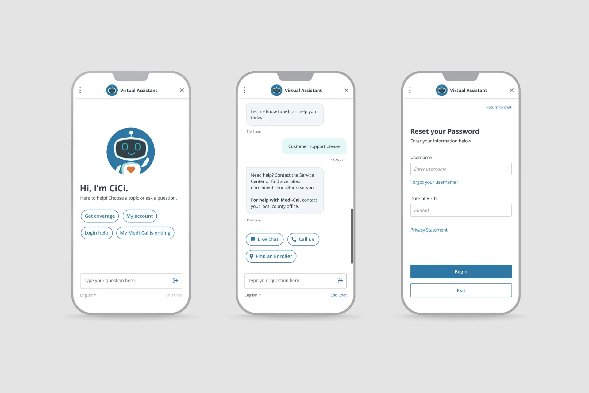
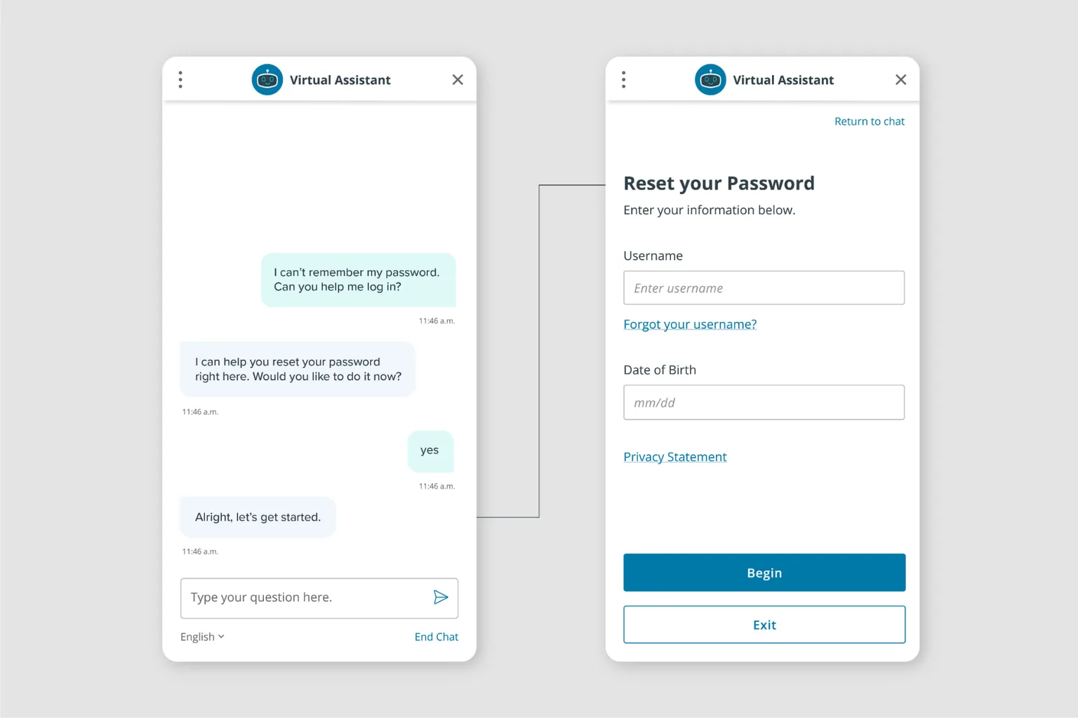
This reframed the project. CiCi could do more than answer questions; it could help people complete real tasks. Those included checking application status, recovering a username, resetting a password, and checking whether employer coverage met federal affordability standards.
Design & Iteration
The redesign leaned into simplicity: more white space, brand-aligned colors, better readability, and answers broken into shorter, scannable chunks. Escalation to live chat became far more visible.
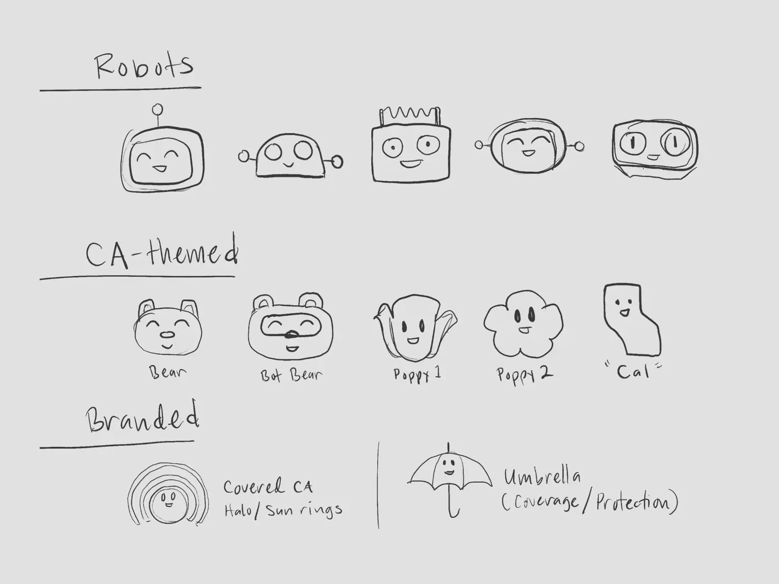
We also gave CiCi a real identity. The original avatar was a stock chatbot image used across sites worldwide, making the product feel borrowed. Drawing on my illustration background, I explored custom robots and California-inspired characters, including a grizzly bear and an anthropomorphic sun. We tested three finalists against the original.
The bear tested best visually, but usability research revealed a problem. People weren't sure whether selecting it would connect them to a chatbot or a person. Clarity mattered more than visual appeal, so we chose a custom robot. She was friendly without being childlike, with a heart on her chest to signal compassion during a stressful moment.
The concept went through two rounds of usability testing before launch, each surfacing refinements.
More Than a Chatbot
The visual work was only half of it. CiCi also needed to help people complete tasks, not just explain how. People can now reset a password, check their coverage status, and move from Medi-Cal to a Covered California plan on their own. Previously, these tasks meant navigating the site alone or picking up the phone.
The Outcome
The redesigned CiCi launched with a simpler interface, more scannable answers, clearer paths to human help, and a distinct visual identity. It received strong positive feedback from consumers and leadership alike.
Expanded self-service capabilities helped more users complete tasks independently, reducing friction and call volume to our call center.
The team continues to evolve CiCi with better feedback collection, motion, and more contextual, in-application guidance. It's proof that treating a chatbot as a full product experience, not a bolted-on feature, pays off.