Eyeconic.com Homepage Redesign
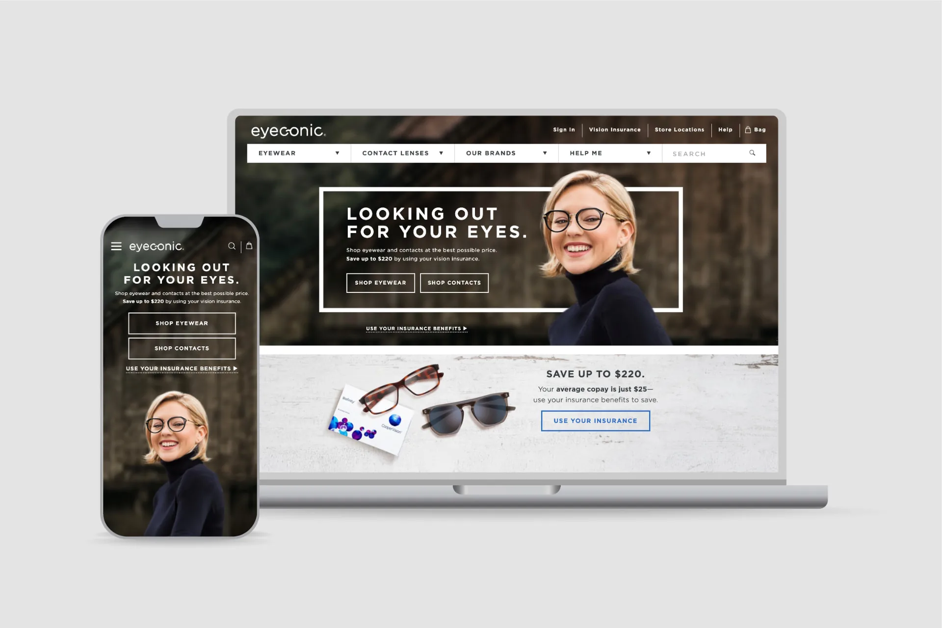
Eyeconic was the only online eyewear retailer where shoppers could apply VSP vision insurance benefits directly at checkout. That was a genuine advantage, but the homepage never said so. I led a redesign to make it the foundation of a clear value proposition.
- Role
- Lead UX Designer, Researcher
- Focus
- E-Commerce, Research, UI Design
The Problem
The existing homepage chased seasonal trends with frequently changing shopping messages and no consistent story. First-time visitors couldn't tell what made Eyeconic different from other eyewear sites. Many competitors sold comparable frames at lower list prices, while Eyeconic's connection to VSP, the nation's largest vision insurer, was nearly invisible.
Site metrics backed up the concern: bounce rates and drop-off were concentrated right at the homepage.
Research & Discovery
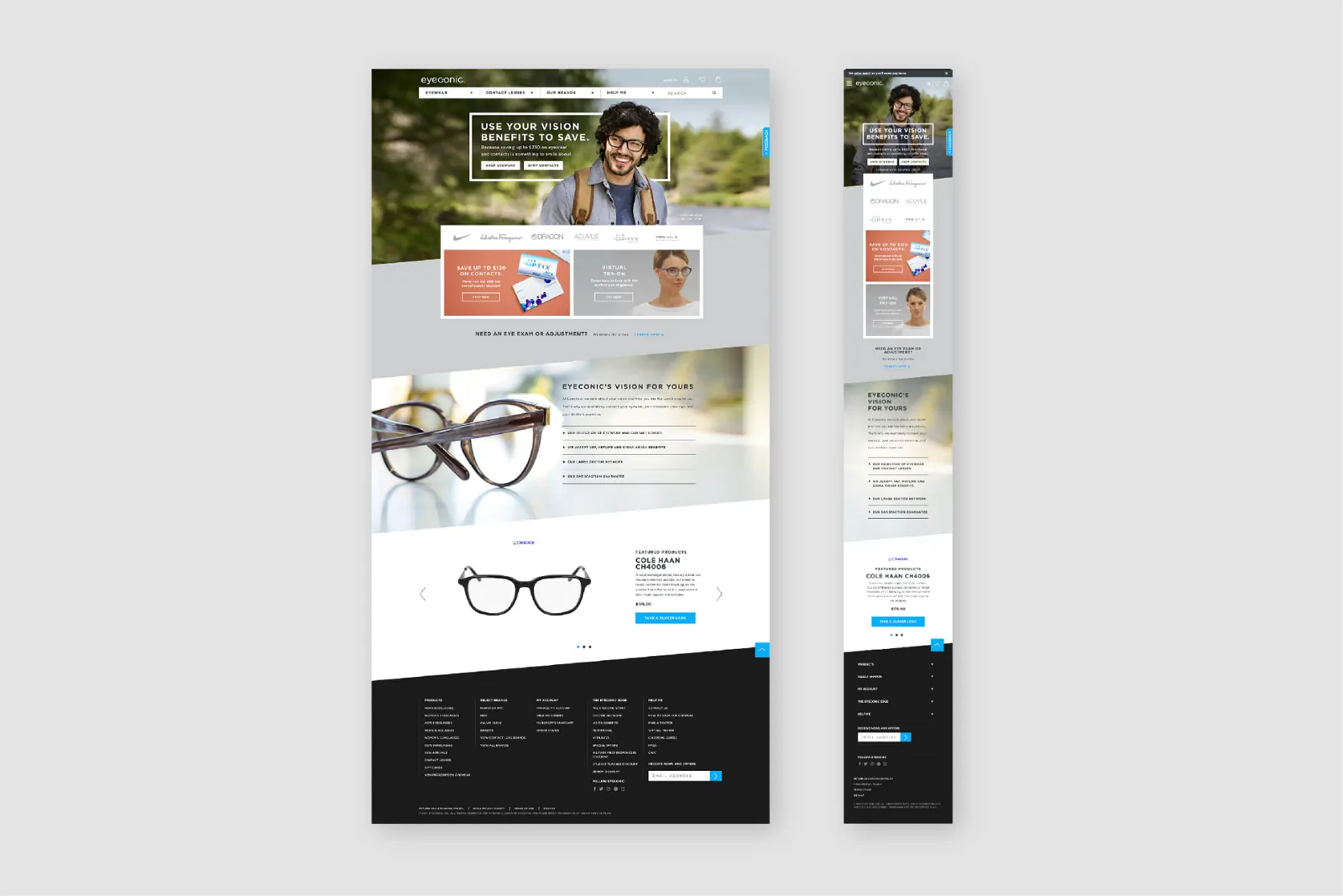
A six-person usability study and sentiment analysis surfaced three consistent findings. People couldn't explain what set Eyeconic apart. The frequently changing content felt disorienting rather than engaging. Most participants didn't know they could apply vision benefits toward a purchase.
That reframed the goal. This was an awareness problem, not a merchandising problem.
Design & Iteration
A first round of sketches went through sentiment testing to check direction. It was trending right but too vague. People wanted specifics: real savings numbers, recognizable frame brands, and reassurance about what happens if an order goes wrong.
The High-Fidelity Direction
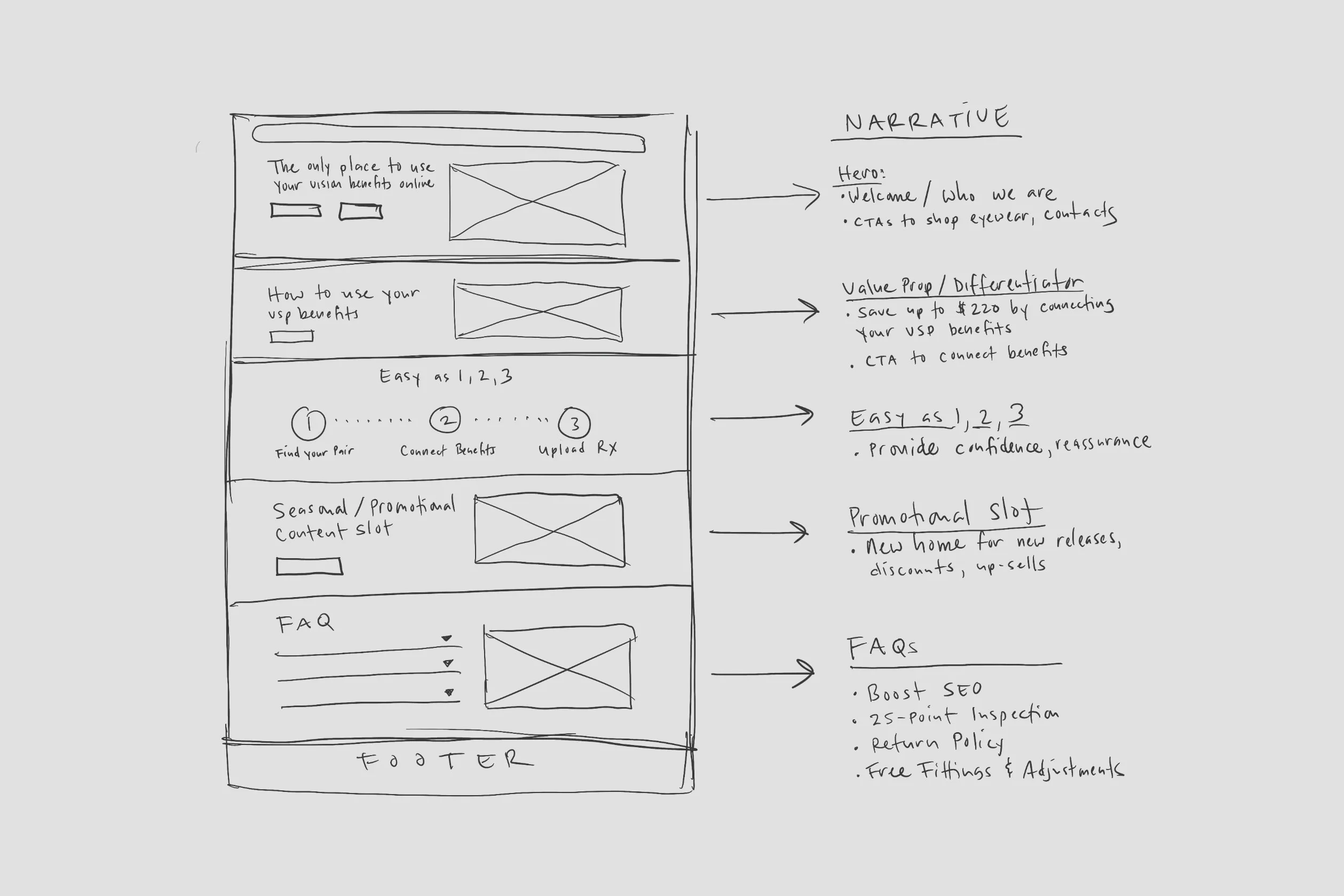
The high-fidelity direction put Eyeconic's insurance advantage in a year-round hero. A brand logo carousel showed the range from entry-level to luxury frames. A permanent benefits module displayed real-time discounted prices once shoppers connected a VSP plan.
Seasonal offers moved into a separate promotional slot so they no longer diluted the core message. A concise FAQ answered the questions shoppers most often arrived with.
The Outcome
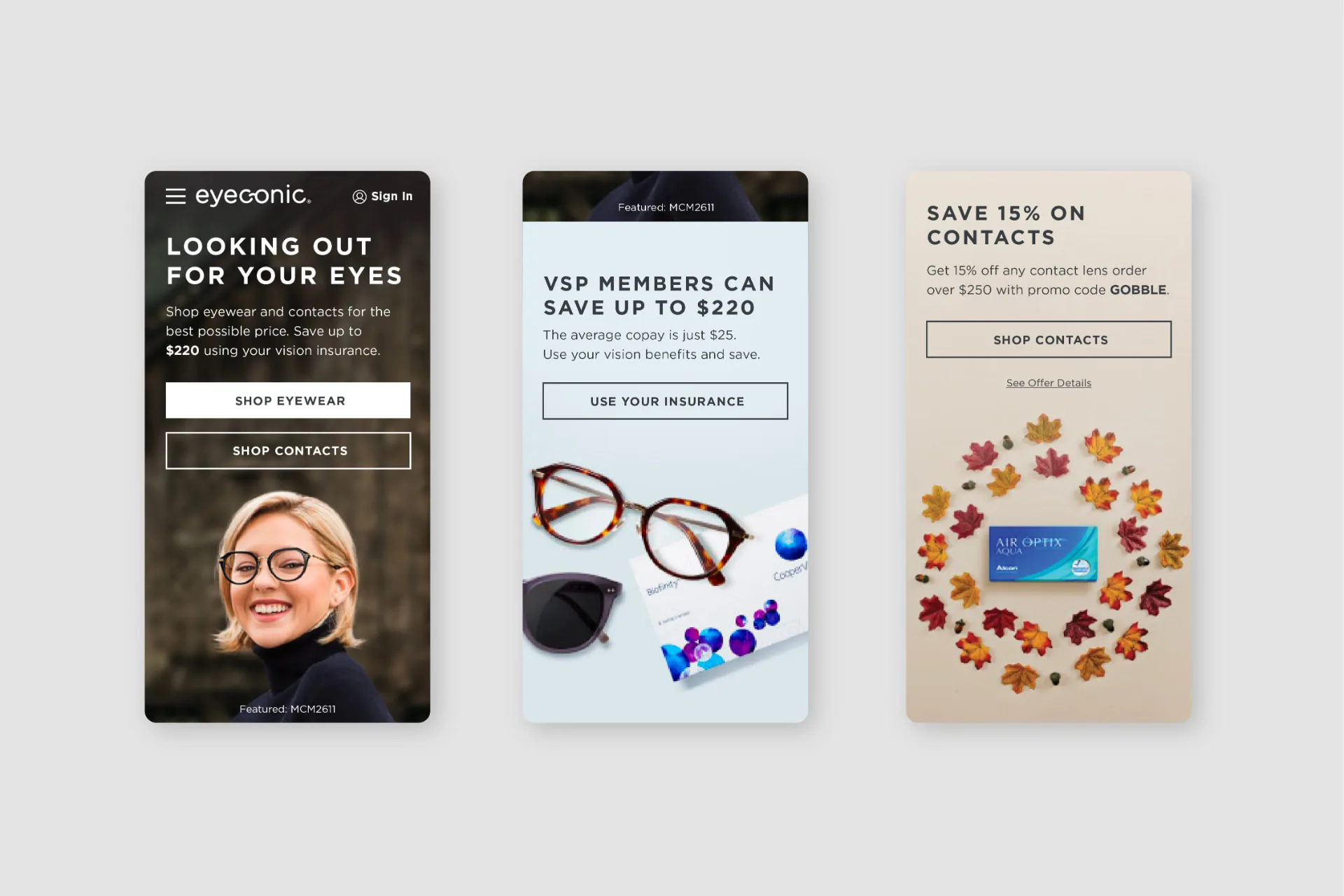
The redesigned homepage cut bounce rate by 18% and increased average engagement time from 10 to 25 seconds. It also contributed to 8% year-over-year sales growth across the site.